> For the complete documentation index, see [llms.txt](https://hartans-organization.gitbook.io/hartan-docs/llms.txt). Markdown versions of documentation pages are available by appending `.md` to page URLs; this page is available as [Markdown](https://hartans-organization.gitbook.io/hartan-docs/components/accordion.md).
# Accordion
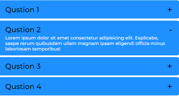
Preview
### Usage
The accordion uses a custom hook [useAccordion](/hartan-docs/hooks/useaccordion.md), for the collapsible functionality.
> ```bash
> npm i react-hartan
> ```
```jsx
import { Accordion } from "react-hartan"
function App() {
return (
<>
)
}
export default App
```
### Customization With Props
* **`accordionList`** -> This prop is required to be sent by the user. It accepts an **array of objects,** where each element is an object of the structure:
```javascript
{
question: "",
answer: ""
}
```
{% hint style="info" %}
NOTE: Keep the name of the keys same as above.
{% endhint %}
* `id` -> The id prop is similar to the id attribute in HTML. It allows to provide overall component id.
* **`userAccordionStyle`** -> The custom styling prop which accepts class name(s) for the full accordion section/component.
* **`userAccordionBoxStyle`** -> The custom styling prop which accepts class name(s) for each accordion label containing both the visible and hidden parts.
* **`userAccordionTitleStyle`** -> The custom styling prop which accepts class name(s) for only the visible part inside an accordion label.
* **`userAccordionQuesStyle`** -> The custom styling prop which accepts class name(s) for the question text inside the visible title part of each accordion label.
* **`userAccordionSignStyle`** -> The custom styling prop which accepts class name(s) for the sign used to show/hide hidden text inside the visible title part of each accordion label.
* **`userAccordionContentHideStyle`** -> The custom styling prop which accepts class name(s) for the hidden content inside each accordion label when it's not shown.
* **`userAccordionContentShowStyle`** -> The custom styling prop which accepts class name(s) for the hidden content inside each accordion label when it becomes visible.
#### Example
{% tabs %}
{% tab title="Default" %}
{% code overflow="wrap" %}
```jsx
import { Accordion } from "react-hartan"
function App() {
return (
<>
)
}
export default App
```
{% endcode %}
{% endtab %}
{% tab title="With Custom Props" %}
{% code overflow="wrap" %}
```jsx
// App.css
.my-class{
font-size: 2rem;
background-color: red;
}
// App.jsx
import { Accordion } from "react-hartan"
const list = [
{
question: "Qustion 1",
answer: "Lorem ipsum dolor sit amet consectetur adipisicing elit. Explicabo, saepe rerum quibusdam ullam magnam ipsam eligendi officia minus laboriosam temporibus!",
},
{
question: "Qustion 2",
answer: "Lorem ipsum dolor sit amet consectetur adipisicing elit. Explicabo, saepe rerum quibusdam ullam magnam ipsam eligendi officia minus laboriosam temporibus!",
}
];
function App() {
return (
<>
)
}
export default App
```
{% endcode %}
{% endtab %}
{% endtabs %}
### Component Code
This is the code for the Accordion component.
{% tabs %}
{% tab title="Accordion.jsx" %}
{% code overflow="wrap" %}
```jsx
import accordionStyle from "./Accordion.module.css"
import useAccordion from "../../Hooks/Accordion"
import PropTypes from "prop-types"
const list = [
{
question: "Qustion 1",
answer: "Lorem ipsum dolor sit amet consectetur adipisicing elit. Explicabo, saepe rerum quibusdam ullam magnam ipsam eligendi officia minus laboriosam temporibus!",
},
{
question: "Qustion 2",
answer: "Lorem ipsum dolor sit amet consectetur adipisicing elit. Explicabo, saepe rerum quibusdam ullam magnam ipsam eligendi officia minus laboriosam temporibus!",
},
{
question: "Qustion 3",
answer: "Lorem ipsum dolor sit amet consectetur adipisicing elit. Explicabo, saepe rerum quibusdam ullam magnam ipsam eligendi officia minus laboriosam temporibus!",
},
{
question: "Qustion 4",
answer: "Lorem ipsum dolor sit amet consectetur adipisicing elit. Explicabo, saepe rerum quibusdam ullam magnam ipsam eligendi officia minus laboriosam temporibus!",
},
];
const symbolButtons = {
openSymbol: "+",
closeSymbol: "-"
};
export default function Accordion({ accordionList = list, symbols = symbolButtons, id, userAccordionStyle, userAccordionBoxStyle, userAccordionTitleStyle, userAccordionQuesStyle, userAccordionSignStyle, userAccordionContentShowStyle, userAccordionContentHideStyle }) {
const [openAccordion, toggle] = useAccordion(null);
return (
{
accordionList.map((data, id) => {
return (
toggle(id)} >
{data.question}{openAccordion == id ? symbols.closeSymbol : symbols.openSymbol}