> For the complete documentation index, see [llms.txt](https://hartans-organization.gitbook.io/hartan-docs/llms.txt). Markdown versions of documentation pages are available by appending `.md` to page URLs; this page is available as [Markdown](https://hartans-organization.gitbook.io/hartan-docs/components/form.md).
# Form
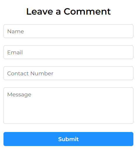
Preview
### Usage
> ```bash
> npm i react-hartan
> ```
```jsx
import { Form } from "react-hartan"
function App() {
const [updateData, submit, submitted, returnValue] = useForm("");
return (
<>
)
}
export default App
```
### Customization With Props
* `fields` -> Required to be sent by the user, accepts an **object,** of the following structure:
```javascript
{
inputTag: [
{
inputType: "", // string
inputId: "", // string
inputName: "", // string
inputLabel: "", // string
required: true // boolean
},
],
textareaTag: [
{
textareaId: "", // string
textareaName: "", // string
textareaLabel: "", // string
required: true // boolean
}
]
}
```
{% hint style="info" %}
NOTE: Keep the name of the keys same as above.
{% endhint %}
* `formTitle` -> Accepts a string value, used as the form heading.
* `updateData` -> Accepts a function provided by the [useForm](/hartan-docs/hooks/useform.md) hook but it should be passed down from the user for updating form fields.
* `submit` -> Accepts a function provided by the [useForm](/hartan-docs/hooks/useform.md) hook but it should be passed down from the user for submitting the form data.
* `submitted` -> Accepts a state value provided by the [useForm](/hartan-docs/hooks/useform.md) hook but it should be passed down from the user to show the submitted animation.
* `id` -> The id prop is similar to the id attribute in HTML. It allows to provide overall component id.
* `userFormCardStyle` -> Accepts class name(s) as string, custom styling prop for the fullthe full form card container.
* `userTitleStyle` -> Accepts class name(s) as string, custom styling prop for the heading of the form inside form card.
* `userFormStyle` -> Accepts class name(s) as string, custom styling prop for the form container inside form card.
* `userInputFieldStyle` -> Accepts class name(s) as string, custom styling prop for the input fields container.
* `userSubmittedStyle` -> Accepts class name(s) as string, custom styling prop for the submitted container.
* `userSubmittedSVGStyle` -> Accepts class name(s) as string, custom styling prop for the submitted svg.
{% tabs %}
{% tab title="Default" %}
{% code overflow="wrap" %}
```jsx
import { Form } from "react-hartan"
function App() {
const [updateData, submit, submitted, returnValue] = useForm("");
return (
<>
)
}
export default App
```
{% endcode %}
{% endtab %}
{% tab title="With Custom Props" %}
{% code overflow="wrap" %}
```jsx
// App.css
.m-2{
margin: 2rem;
}
.bg-pink{
background-color: pink;
}
.my-class{
font-size: 2rem;
background-color: red;
padding: 1rem;
}
// App.jsx
import { Form } from "react-hartan"
export default function App() {
const [updateData, submit, submitted, returnValue] = useForm("");
return (
<>
)
}
```
{% endcode %}
{% endtab %}
{% endtabs %}
### Component Code
This is the code for Form component.
{% tabs %}
{% tab title="Form.jsx" %}
{% code overflow="wrap" %}
```jsx
import formStyle from "./Form.module.css"
import PropTypes from "prop-types"
const fieldsData = {
inputTag: [
{
inputType: "text",
inputId: "name",
inputName: "name",
inputLabel: "Name",
required: true
},
{
inputType: "email",
inputId: "email",
inputName: "email",
inputLabel: "Email",
required: true
},
{
inputType: "number",
inputId: "phoneNo",
inputName: "phoneNo",
inputLabel: "Contact Number",
required: true
}
],
textareaTag: [
{
textareaId: "message",
textareaName: "message",
textareaLabel: "Message",
required: true
}
]
};
export default function Form({ fields = fieldsData, formTitle = "Leave a Comment", updateData, submit, submitted, id, userFormCardStyle, userTitleStyle, userFormStyle, userInputFieldStyle, userSubmittedStyle, userSubmittedSVGstyle }) {
return (