### Usage
> ```bash
> npm i react-hartan
> ```
```jsx
import { Sidemenu } from "react-hartan"
function App() {
return (
<>
)
}
export default App
```
### Customization With Props
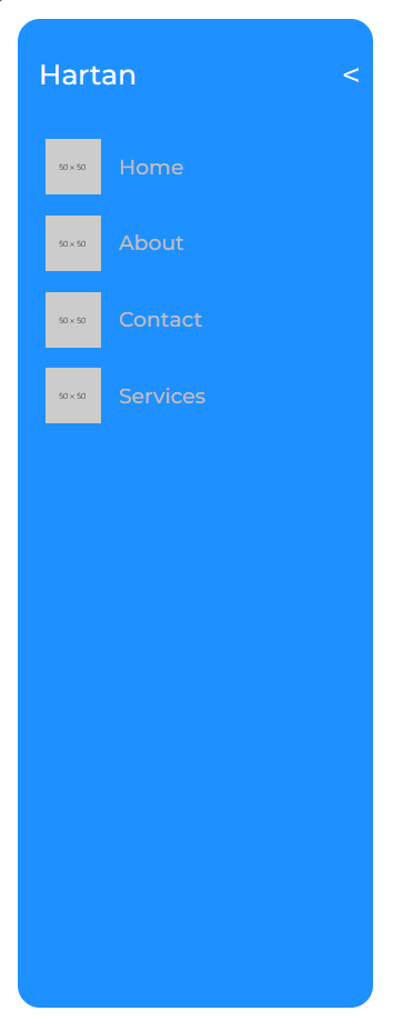
* `navList` -> Accepts an array, where each element is an object of the structure:
{% code overflow="wrap" %}
```javascript
{
logo: <>,
elem: <>,
}
```
{% endcode %}
{% hint style="info" %}
NOTE: Keep the name of the keys same as above.
{% endhint %}
* `logoName` -> Accepts a string/node value, used inside sidemenu as heading.
* `id` -> The id prop is similar to the id attribute in HTML. It allows to provide overall component id.
* `userNavbarStyle` -> Accepts the class name(s) as string, custom styling prop for the full sidemenu container.
* `userNavToggleStyle` -> Accepts the class name(s) as string, custom styling prop for container for toggling sidemenu checkbox.
* `userNavHeaderStyle` -> Accepts the class name(s) as string, custom styling prop for container containing title and arrow.
* `userNavTitleStyle` -> Accepts the class name(s) as string, custom styling prop for the logo name.
* `userNavContentStyle` -> Accepts the class name(s) as string, custom styling prop for the container containing the sidemenu item list.
* `userNavButtonStyle` -> Accepts class name(s) as string, custom styling prop for the container containing each sidemenu item.
{% tabs %}
{% tab title="Default" %}
```jsx
import { Sidemenu } from "react-hartan"
function App() {
return (
<>
)
}
export default App
```
{% endtab %}
{% tab title="With Custom Props" %}
{% code overflow="wrap" %}
```jsx
// App.css
.bg-red{
padding: 2rem;
background-color: red;
}
.bg-pink{
background-color: pink;
}
// App.jsx
import { Sidemenu } from "react-hartan"
function App() {
return (
<>
)
}
export default App
```
{% endcode %}
{% endtab %}
{% endtabs %}
### Component Code
This is the code for the Popup component.
{% tabs %}
{% tab title="Sidemenu.jsx" %}
{% code overflow="wrap" %}
```jsx
import sidemenuStyle from "./Sidemenu.module.css"
import PropTypes from "prop-types"
const list = [
{
logo: ,
elem: Home,
},
{
logo: ,
elem: About,
},
{
logo: ,
elem: Contact,
},
{
logo: ,
elem: Services,
},
];
export default function Sidemenu({ navList = list, logoName = "Hartan", id, userNavbarStyle, userNavToggleStyle, userNavHeaderStyle, userNavTitleStyle, userNavContentStyle, userNavButtonStyle }) {
return (
{logoName}
{
navList.map((item, id) => {
return (
{item.logo}
{item.elem}
)
})
}
)
}
Sidemenu.propTypes = {
navList: PropTypes.arrayOf(PropTypes.shape(
{
logo: PropTypes.node,
elem: PropTypes.node
}
)),
logoName: PropTypes.node,
id: PropTypes.string,
userNavbarStyle: PropTypes.string,
userNavToggleStyle: PropTypes.string,
userNavHeaderStyle: PropTypes.string,
userNavTitleStyle: PropTypes.string,
userNavContentStyle: PropTypes.string,
userNavButtonStyle: PropTypes.string
};
```
{% endcode %}
{% endtab %}
{% tab title="Sidemenu.module.css" %}
````css
/* Sidemenu Styling */
/* css to open and close the menu based on state of checkbox */
.navToggle:checked~.navHeader {
width: calc(8rem - 1.6rem);
}
.navToggle:checked~.navContent {
width: 8rem;
}
.navToggle:checked~.navHeader .navTitle {
opacity: 0;
pointer-events: none;
transition: opacity 0.1s;
}
.navToggle:checked~.navHeader .lableTag {
left: calc(50% - .8rem);
font-size: x-large;
transform: rotate(180deg);
}
.navToggle:checked~.navContent .navButton span {
opacity: 0;
transition: opacity 0.1s;
}
/* css for sidemenu and everything inside it. */
.navBar {
position: absolute;
left: 1vw;
top: 1vw;
height: calc(100% - 2vw);
background: #1e90ff;
border-radius: 16px;
display: flex;
flex-direction: column;
color: #ffffff;
overflow: hidden;
user-select: none;
}
.navBar a {
color: inherit;
text-decoration: inherit;
}
.navBar input[type=checkbox] {
display: none;
}
.navHeader {
position: relative;
width: 25.6rem;
left: 1.5rem;
width: calc(25.6rem - 16px);
min-height: 80px;
border-radius: 1.5rem;
z-index: 2;
display: flex;
align-items: center;
transition: width 0.2s;
}
.navTitle {
font-size: 2rem;
transition: opacity 1s;
font-weight: 500;
}
.lableTag {
position: absolute;
right: 0;
width: 3rem;
height: 100%;
display: flex;
align-items: center;
justify-content: center;
cursor: pointer;
font-size: x-large;
}
.navContent {
margin: -1.6rem 0;
padding: 1.5rem 0;
position: relative;
flex: 1;
width: 25.6rem;
direction: rtl;
overflow-x: hidden;
transition: width 0.2s;
}
.navContent::-webkit-scrollbar {
width: .75rem;
height: .75rem;
}
.navContent::-webkit-scrollbar-thumb {
border-radius: 10rem;
background-color: rgb(88, 87, 87);
}
.navContent::-webkit-scrollbar-button {
height: 1.5rem;
}
.navButton {
position: relative;
margin-left: 2rem;
height: 5.5rem;
display: flex;
align-items: center;
font-size: 1.5rem;
font-weight: 500;
color: rgb(194, 187, 187);
direction: ltr;
cursor: pointer;
z-index: 1;
transition: color 0.2s;
}
.navButton img {
margin-right: 1.25rem;
height: 4rem;
object-fit: contain;
}
.navButton span {
transition: opacity 1s;
display: flex;
align-items: center;
justify-content: center;
}
.navButton:hover span {
color: #ffffff;
font-weight: 500;
}
/* responsive design */
@media (width < 1024px) {
.navToggle:not(:checked)~.navHeader {
width: calc(8rem - 1.6rem);
}
.navToggle:not(:checked)~.navContent {
width: 8rem;
}
.navToggle:not(:checked)~.navHeader .navTitle {
opacity: 0;
pointer-events: none;
transition: opacity 0.1s;
}
.navToggle:not(:checked)~.navHeader .lableTag {
left: calc(50% - .8rem);
font-size: x-large;
transform: rotate(-180deg);
}
.navToggle:not(:checked)~.navContent .navButton span {
opacity: 0;
transition: opacity 0.1s;
}
.navToggle:checked~.navHeader {
width: calc(25.6rem - 16px);
}
.navToggle:checked~.navContent {
width: 25.6rem;
}
.navToggle:checked~.navHeader .navTitle {
opacity: 1;
}
.navToggle:checked~.navHeader .lableTag {
left: calc(50% + 8rem);
transform: rotate(0deg);
}
.navToggle:checked~.navContent .navButton span {
opacity: 1;
}
}
```
````
{% endtab %}
{% endtabs %}
---
# Agent Instructions: Querying This Documentation
If you need additional information that is not directly available in this page, you can query the documentation dynamically by asking a question.
Perform an HTTP GET request on the current page URL with the `ask` query parameter:
```
GET https://hartans-organization.gitbook.io/hartan-docs/components/sidemenu.md?ask=
```
The question should be specific, self-contained, and written in natural language.
The response will contain a direct answer to the question and relevant excerpts and sources from the documentation.
Use this mechanism when the answer is not explicitly present in the current page, you need clarification or additional context, or you want to retrieve related documentation sections.