> For the complete documentation index, see [llms.txt](https://hartans-organization.gitbook.io/hartan-docs/llms.txt). Markdown versions of documentation pages are available by appending `.md` to page URLs; this page is available as [Markdown](https://hartans-organization.gitbook.io/hartan-docs/components/card.md).
# Card
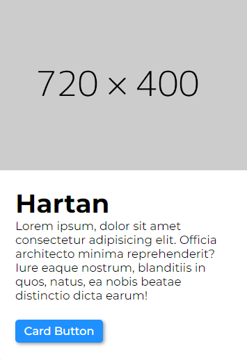
Preview
### Usage
The card displays some information, and image is also available.
> ```bash
> npm i react-hartan
> ```
{% code overflow="wrap" %}
```jsx
import { Card } from "react-hartan"
function App() {
return (
<>
)
}
export default App
```
{% endcode %}
### Customization With Props
* `imgSrc` -> Accepts an image link, a string, which is shown inside the card.
* `imgState` -> Accepts a boolean value, which is used to toggle the image state.
* `imgAlt` -> Accepts an image alt.
* `contentHeading` -> Accepts a string value, which is the card heading.
* `contentPara` -> Accepts a string value, which is card paragraph text.
* `buttonText` -> Accepts a string value, used as the button name.
* `onClickFunction` -> Accepts a function, written by the user, which handles the logic when the button is clicked.
* `id` -> The id prop is similar to the id attribute in HTML. It allows to provide overall component id.
* `imgLoad` -> The imgLoad prop is mapped to the loading attribute in HTML img tag. It allows to provide overall the value for loading attribute, "lazy" | "eager".
* `userButtonStyle` -> The custom styling prop which accepts class name(s) for the button styling inside the Card component.
* `userCardStyle` -> The custom styling prop which accepts class name(s) for the full Card component.
* `userContentStyle` -> The custom styling prop which accepts class name(s) for the content inside the card component.
{% tabs %}
{% tab title="Default" %}
```jsx
import { Card } from "react-hartan"
function App() {
return (
<>
)
}
export default App
```
{% endtab %}
{% tab title="With Custom Props" %}
```jsx
// App.css
.my-class{
background-color: red;
font-size: 2rem;
}
// App.jsx
import { Card } from "react-hartan"
function App() {
return (
<>
)
}
export default App
```
{% endtab %}
{% endtabs %}
### Component Code
This is the code for the Card component.
{% tabs %}
{% tab title="Card.jsx" %}
{% code overflow="wrap" %}
```jsx
import Button from "../Button/Button"
import cardStyle from "./Card.module.css"
import PropTypes from "prop-types"
const para = "Lorem ipsum, dolor sit amet consectetur adipisicing elit. Officia architecto minima reprehenderit? Iure eaque nostrum, blanditiis in quos, natus, ea nobis beatae distinctio dicta earum!"
export default function Card({ buttonText = "Card Button", onClickFunction, userButtonStyle, imgSrc = "https://dummyimage.com/720x400", imgState = true, imgAlt= "Hartan" , contentHeading = "Hartan", contentPara = para, id, imgLoad userCardStyle, userContentStyle }) {
return (
{
imgState &&
}
{contentHeading}
{contentPara}
)
}
Card.propTypes = {
contentHeading: PropTypes.node,
contentPara: PropTypes.node,
buttonText: PropTypes.node,
userButtonStyle: PropTypes.string,
onClickFunction: PropTypes.func,
imgSrc: PropTypes.string,
imgState: PropTypes.bool,
imgAlt: PropTypes.string,
id: PropTypes.string,
userCardStyle: PropTypes.string,
userContentStyle: PropTypes.string,
};
```
{% endcode %}
{% endtab %}
{% tab title="Card.module.css" %}
{% code overflow="wrap" %}
```css
/* Card CSS Module */
/* Styling for full card */
.cardSection {
display: flex;
flex-direction: column;
align-items: center;
overflow: hidden;
border: .15rem solid rgb(194, 191, 191);
border-radius: .5rem;
width: 29rem;
gap: 1.5rem;
box-shadow: rgba(99, 99, 99, 0.2) 0px 2px 8px 0px;
}
/* Styling for full card when hovered */
.cardSection:hover {
box-shadow: rgba(100, 100, 111, 0.2) 0px 7px 29px 0px;
}
/* Styling for the container containing image inside the card */
.cardSection figure {
display: flex;
justify-content: center;
align-items: center;
}
/* Styling for the image inside the card */
.cardSection figure img {
height: 20rem;
}
/* Styling for content container inside the card */
.content {
padding: .5rem 2rem 2rem 2rem;
display: flex;
flex-direction: column;
justify-content: center;
align-items: start;
gap: 2rem;
}
/* Styling for the heading inside the content container */
.content h1 {
font-size: 3rem;
}
/* Styling for the paragraph text inside the content container */
.content div {
font-size: 1.35rem;
}
```
{% endcode %}
{% endtab %}
{% endtabs %}
---
# Agent Instructions
This documentation is published with GitBook. GitBook is the documentation platform designed so that both humans and AI agents can read, navigate, and reason over technical content effectively. Learn more at gitbook.com.
## Querying This Documentation
If you need additional information that is not directly available in this page, you can query the documentation dynamically by asking a question.
Perform an HTTP GET request on the current page URL with the `ask` query parameter:
```
GET https://hartans-organization.gitbook.io/hartan-docs/components/card.md?ask=
```
The question should be specific, self-contained, and written in natural language.
The response will contain a direct answer to the question and relevant excerpts and sources from the documentation.
Use this mechanism when the answer is not explicitly present in the current page, you need clarification or additional context, or you want to retrieve related documentation sections.